(416) 250-6856
 contact@drywalltoronto.ca
 Mon-Fri: 8AM - 4PM

Top Interior Paint Colors for Canadian Homes in 2025
When we’re finishing drywall, the final coat of paint is what sets the tone for a space. Color is more than a surface choice — it shifts how light feels, how rooms connect, and how homeowners experience their space every day. In 2025, Canadian design trends lean toward softer earth tones, nature-inspired palettes, and accent shades that bring depth without overpowering. We’ve also noticed a growing interest in how sheen impacts durability and cleaning, especially for families with kids or pets. Many homeowners start with online inspiration boards, but their choices often change once samples are tested on walls. At Express Drywall Services, we prepare every surface so these top interior paint colors look vibrant and perform well for years, no matter which direction trends go.
As a drywall and finishing company, we notice the shades homeowners gravitate toward before they even hit the big trend lists. Here’s what we’re seeing in homes across Toronto, Barrie, and beyond. Our team tracks requests and compares them to what suppliers are pushing, which gives us a clear picture of where the market is headed. This means we can advise clients not just on what’s popular but also on what will age gracefully in real homes.
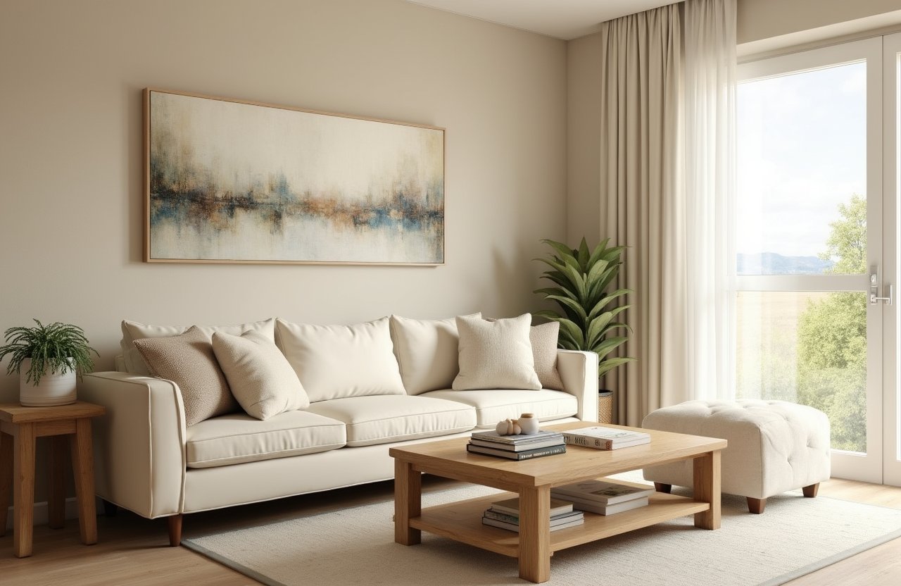
Warm Neutrals Making a Comeback
Soft taupes and clay-inspired hues are stepping ahead of the cooler greys that dominated the last decade. Benjamin Moore’s Natural Linen (OC-90) has been requested in three of our last six projects – it reads calm in daylight and cozy at night. Behr’s Blank Canvas (DC-003) is trending as a wall-to-ceiling color, especially in open-concept condos. Warm neutrals tend to add softness to rooms without making them feel outdated, which is why so many homeowners are making the switch. They also play well with natural materials, like oak flooring and stone countertops, making them versatile for both modern and traditional interiors.
Best Rooms for Warm Neutrals
The trade-off – warm neutrals create inviting rooms but can flatten contrast if every surface goes beige. Pairing them with crisp white trim or dark wood flooring keeps the look grounded. We often suggest accent textures like brick, tile or even fabric wall panels to avoid monotony. In larger open-concept homes, these shades create flow, but in smaller spaces, careful lighting is needed to prevent them from feeling too heavy.
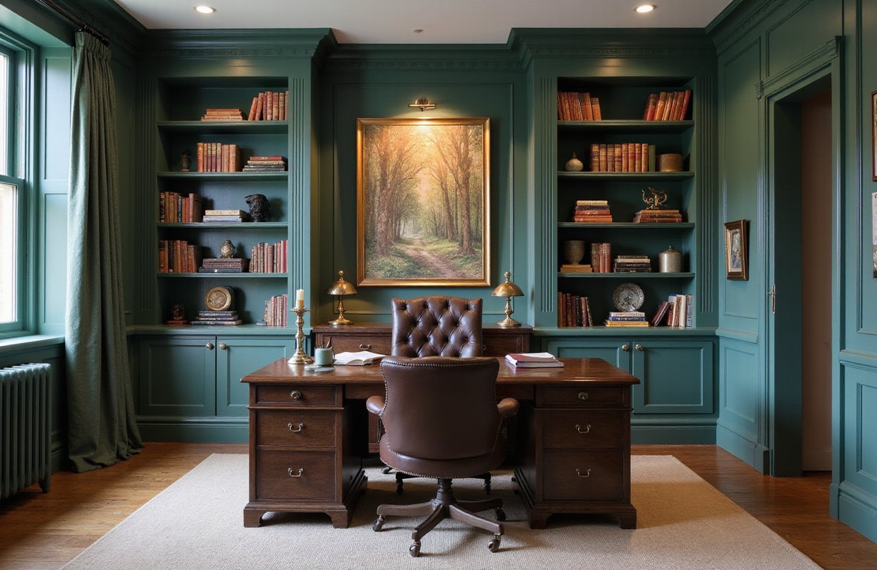
Deep Blues and Greens as Feature Colors
Not every wall needs to stay neutral. Canadian homeowners are leaning into rich blues and greens for depth. Sherwin-Williams Evergreen Fog (SW 9130) still holds popularity, especially in kitchens. Sico’s Ocean Depth is showing up in living rooms and dens for a bold but livable choice. These colors add personality without overwhelming a room when used strategically. We’ve also seen them in dining rooms, paired with gold light fixtures, which brings a touch of elegance without looking overly formal.
How to Use Bold Shades Without Overdoing It
We’ve seen a single accent wall in a basement rec room shift the entire mood. But darker tones need careful drywall finishing – every seam shows if the prep isn’t perfect. That’s where our priming and sanding process pays off, ensuring a flawless surface. Proper lighting design is also critical to keep these shades looking rich instead of flat. For hesitant homeowners, we recommend testing bold shades in smaller spaces first – powder rooms or home offices are great places to experiment.
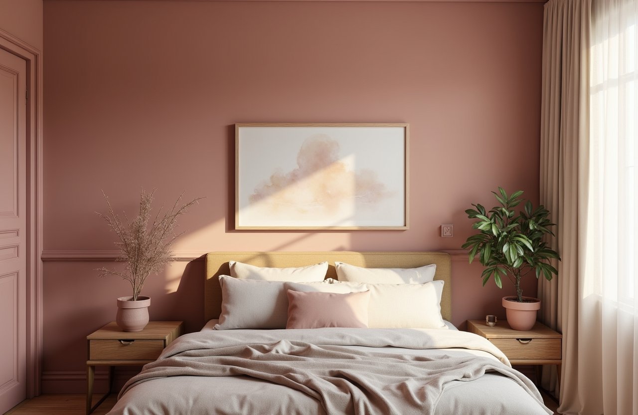
Muted Pinks and Clay Reds
Designers aren’t pushing neon or candy shades. Instead, 2025 brings softer clay pinks and desert reds. Think weathered brick more than bubblegum. Farrow & Ball Setting Plaster has shown up in Toronto lofts and Muskoka cottages alike. Dulux’s Muted Rose works well in bedrooms paired with matte black fixtures. These colors bring warmth while still feeling sophisticated, making them especially appealing for spaces meant to feel personal and calming. They also stand out against crisp whites and natural woods, giving homeowners plenty of pairing options.
Coverage Challenges with Red Tones
The downside? Reds and pinks often need extra coats to cover evenly. We typically plan for 3 coats over fresh drywall. Using tinted primer underneath reduces streaking and cuts down on wasted paint. Without that preparation, patchiness is almost unavoidable, especially under strong lighting. For high-traffic areas, we also recommend choosing a finish that’s easy to clean so the bold look stays fresh over time.
Off-Whites with Character
White isn’t disappearing, but it’s evolving. Stark bright whites are out and creamy or chalky off-whites are in. Benjamin Moore’s Chantilly Lace (OC-65) remains a safe bet, though warmer whites like White Dove (OC-17) are stealing attention. These shades bounce natural light better than greys did – great for northern-facing Canadian rooms. They’re also flexible enough to support bold accent walls or colorful furniture. That’s why many homeowners are shifting toward layered palettes with whites as the base.
Testing Whites Before You Commit
One caution – off-whites can shift tone based on flooring. Against maple wood, they read warm. Against grey tile, sometimes yellowish. We always recommend testing a sample board before committing, ideally on multiple walls. Even the direction a room faces can change how a white looks, making it important to observe at different times of day. Small adjustments upfront save frustration later when furniture and lighting are added.
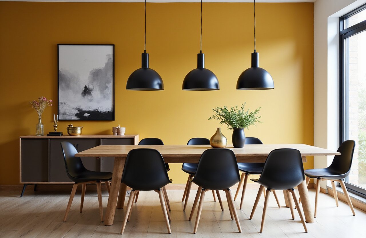
Earthy Accents – Terracotta and Mustard
Natural clay tones are making their way into accent spaces. Terracotta fireplaces or stairwell walls stand out without feeling trendy. Mustard yellows – closer to ochre than bright sunshine – are being used sparingly in dining rooms. We’ve noticed homeowners pairing terracotta with white oak furniture to achieve a warm but modern effect. These earthy shades also connect nicely with outdoor views, bringing a sense of nature indoors.
They’re not for every home, but when combined with textured drywall finishes or brick, they create warmth that lasts. We encourage homeowners to use them selectively, where natural light helps soften their depth. In heritage homes, they can highlight original woodwork, while in new builds, they prevent interiors from feeling too sterile. Used in moderation, they add character without locking a home into a passing trend.
Finish Matters as Much as Color
Paint color grabs the spotlight, but sheen changes everything. We still recommend eggshell for most walls – durable, slightly reflective and forgiving. Matte is trending in bedrooms for its soft, chalky look, but it shows scuffs faster. Kitchens and baths? Satin for easier cleaning. Too much gloss on walls, however, makes imperfections stand out and can feel overwhelming. The right finish balances appearance with everyday function.
Practical Combinations That Work
A trick we use – pair matte ceilings with eggshell walls in the same color family. The difference in sheen subtly defines the space without breaking the palette. Gloss finishes are best for trim and doors, highlighting details while holding up against wear. Semi-gloss walls are rare but occasionally requested in high-moisture areas like laundry rooms. Whatever the choice, our goal is to ensure the finish complements the paint color while standing up to real life.
What We Won’t Do in 2025
Not every color trend is worth chasing. We’ve had requests for glossy jet black kitchens or neon greens – both look striking online, but they don’t age well and are a nightmare for resale. Our rule is simple – if the shade makes you second-guess after a week, it won’t last ten years. Even with the best prep, glossy dark shades highlight every minor imperfection.
We also steer homeowners away from full metallic walls. While they work as accents or behind artwork, an entire room painted in reflective gold or silver quickly overwhelms. These finishes are costly and rarely practical, so we recommend using them sparingly if at all. Trendy doesn’t always mean timeless and our role is to guide clients toward choices that hold up both visually and structurally.
Bringing It All Together
Paint transforms drywall from flat board to finished room. The right shade depends on light, layout and personal style – not just trend charts. At Express Drywall Services, we prep, prime and finish walls so that colors apply evenly and stay true to the chip. Our process is designed to avoid common pitfalls like streaking, uneven coverage or color distortion in different lighting. That means homeowners get the results they envisioned when they first picked up a paint swatch.
If you’re renovating in 2025 and wondering which direction to take, we’ll help you test swatches, compare finishes and create walls ready for years of living. Color trends matter, but durability and craftsmanship matter more – and that’s where we come in.
Why Choose Express Drywall Services
When it comes to paint, walls are only as good as the surface beneath them. That’s where our team makes the difference. We don’t just roll on color – we prepare drywall so that any shade, from soft neutrals to bold accents, looks its best. Homeowners call us because we combine technical drywall skills with design insight, ensuring every finish enhances the space.
Residential and Commercial Expertise
We work with homeowners finishing basements, updating kitchens or refreshing bedrooms. At the same time, we take on commercial projects – from offices to rental units – where durability and precision matter most. Whatever the scope, we adapt our process so every wall gets the right treatment.
Our Core Services
-
Drywall installation and repair – turning open framing into clean, solid surfaces.
-
Taping, mudding and sanding – making seams invisible so paint applies evenly.
-
Priming and painting – delivering lasting color and clean finishes.
-
Popcorn ceiling removal – modernizing ceilings for a fresh look.
-
Soundproofing and insulation upgrades – improving comfort and efficiency.
-
Custom features such as archways, framing accents and moisture-resistant drywall systems.
Why Homeowners Trust Us
Clients tell us they appreciate two things most – clean job sites and on-time delivery. We also stand behind our work – if a wall doesn’t meet our standards, we fix it before calling the job done. That’s why so much of our business comes from referrals and repeat clients. With us, you’re not just getting drywall; you’re getting a partner who understands how design and construction come together.
We handle more than drywall – we help Canadian homeowners finish spaces from start to paint. Let’s talk about your project and pick colors that work in your home, not just on a trend list.